
I tracked a Discord server's bot usage
This was a blog post written for ACM @ UCSD's Medium, which can be found here. This is a verbatim copy of the article found there. Anything that might seem out of context is due to the target audience of the original article.
It was the middle of an otherwise very exotic academic quarter, if not an interesting time for everyone, that I realized I was bored. When I get bored, it’s good, because I look for interesting things to do. (and maybe procrastinate? Nah.) The first thing that came to my mind to pass the time in a more educational manner was data science. I hadn’t had fun with data (or its graphs) in a long time. While I do frequently consult system monitoring graphs using Prometheus and Grafana, it’s certainly not as exciting as looking for something new; we all need to explore sometimes, and looking at essentially a straight line for memory usage is boring.
Anyway, I started thinking what kind of unique data I could conjure up to make for some interesting graphs. I needed something random, something topical, something I had easy access to...hmm...
Discord is good!
Out of all the chat services that have popped out in the world, nothing rivals IRC’s randomness quite like Discord. Clearly inspired from it, Discord is just the perfect platform to feed everyone’s need to socialize, as well as provide a very aesthetically pleasing medium to communicate in (way better quality than Skype, too). Additionally, while there are specific topic channels, it’s just something about Discord that encourages this vibe of random thoughts and chats that I thought would be a perfect candidate for investigation.
Soon enough, I was looking for the most active Discord server I’m in. ACM’s online medium is essentially established in Discord, and it is very much an active server. And just like that, through the power of amazing timing, an opportunity appeared for some interesting data to be acquired.
Recently, I’ve given (re?)birth to BreadBot, a Discord bot previously used by
the members here to relay embed messages on more official channels. I gave it
some more useful commands, such as URL shortening and a few more. However,
during that time, I also added two commands that became quickly very popular:
/cat and /dog.
These two commands would cause BreadBot to simply reply with a cat or dog picture. Simple, cute, but very popular. A decent amount of you would sometimes use these commands to summon cute cat and dog pictures to brighten other’s days. At this point, I saw a good opportunity to acquire some cool data. There’s personal preferences involved, and I already saw a spirit of competition form between the two commands.
I coded functionality in BreadBot to allow it to log commands as they were being requested. It would track time, command, requester of command as well as the channel it was sent on. After I coded it, I announced its tracking on the announcements channel, and told everyone I would be announcing the results in the form of a blog post.
Well, here we are, a couple of months later, and I’ve gathered a decent amount of commands, and since the first year of undergraduate study was over for me, what better time to get started on having fun with the data!
Getting the data out
This was the easiest part, mostly. The command log was essentially a CSV file,
with : as its separator. In hindsight, this was a bad idea at the time I
coded it, since there might have been members in the list with that character
in their username. I should have done something like $$ or some other more
rare separator, which could’ve been better. It’s a good example of why data
sanitization is so important; the easier it is to process data, the more
valuable insights you will obtain faster.
However, I got lucky, as no one had : in their username, so I’m good for this
time.
Now, I spun up a classic Jupyter notebook with an Anaconda environment, and started pulling the data in, refining it for future use.
If you wanna follow along to all of my observations here, I highly recommend you check out the Jupyter notebook I used while writing this post. That way, you can see my thought process behind the metrics I start talking about, as well as how I got them. Think of the notebook as a very educational “behind-the-scenes”.
Who won?
TL;DR: /dog won. But there are other interesting things!
Naturally, everyone who participated is more or less interested in which command won and which command lost. I just thought to get it out of the way faster, since there’s a lot more interesting things to notice with the commands.
It was relatively quick to spin up a bar chart to see who won in the end by
just counting the amount of times each command name appeared in the “command”
column of the dataset. /dog is number one, by a landslide difference of 300
command runs as opposed to the second place command, /cat. Apparently, dogs
are pretty popular!
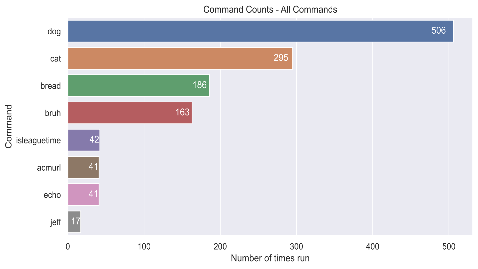
Unsurprisingly, the rest of the command seem to fit my expectations; /bruh, a
command which simply plays a sound you probably already know of, is relatively
common whenever members on the Discord server appear in voice channels, and the
rest of the commands are more or less either new or merely utilities, hence
their lower position on the rankings.
Fun fact and quick tangent: we don’t really need Python or Jupyter notebooks to quickly pull out metrics out of a CSV file. We can just use some simple Unix commands and pipes to get some valuable information out of them, too!
For instance, we can get the sorted number of command runs that the chart above
provides by just running a one-liner:
$ grep <COMMAND> commandCount.log | awk -F: '{print $3}' | sort | uniq -c | sort -nr
I’ll split this up to explain what each command does:
$ grep <COMMAND> commandCount.log \
    # - get all <COMMAND> entries
    | awk -F: '{print $3}' \
    # - extract 3rd field from stream
    #   with delimiter ":"
    | sort \
    # - sort all found users to
    #   group up for "uniq"
    | uniq -c \
    # - count number of unique fields
    #   (usernames, in this case)
    | sort -nr
    # - sort in descending order
While obviously not as good-looking as a chart, it’s still useful information you can grab quick. (Yes, I may use terminals too much)
Returning to the problem that I noticed, however, was that I didn’t consider
each member’s activity when making these charts; not everyone called /dog and
/cat in equal amount each, and some members of the Discord server were more
active than others. I thought I should look into who used each command the
most.
Who used the commands the most?
To see the amount of times each person ran a command, I would simply filter the dataset to only contain one command. Afterwards, I’d count the number of occurrences of “username” columns. After that, I could quickly spin up bar charts for each command BreadBot used.
We’ll start by looking at the top command, /dog.
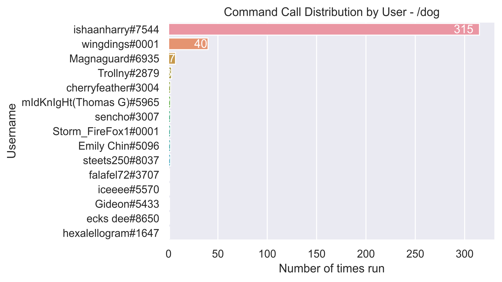
Hmmm, we notice a bit of an anomaly here.
At least for me, this didn’t come as much of a surprise, since I’ve been watching the competition closely since its inception, but it was still amazing the difference in runs between ishaanharry and wingdings. The two were by far the most active users of the two commands (to be fair, wingdings was previously named “David | dog gang”), but regardless, a difference of 275 was still amazing.
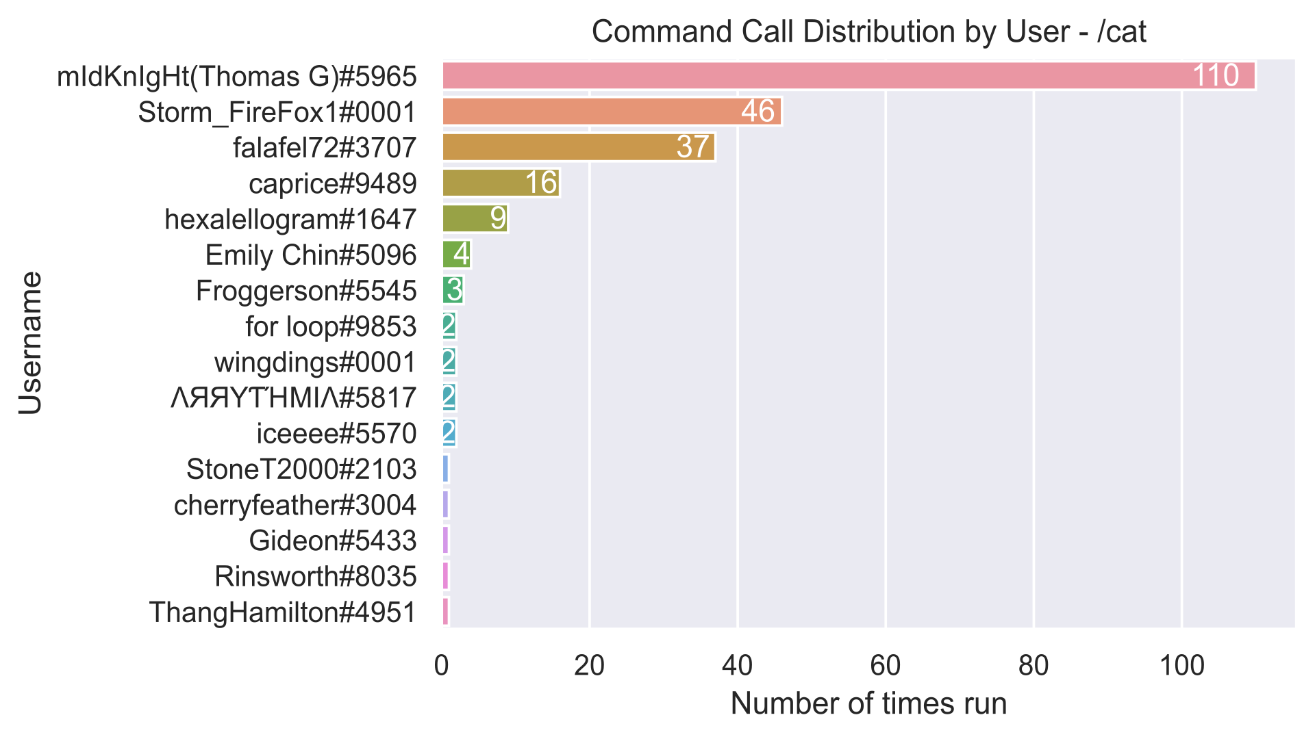
However, I did look at some other commands as well. /cat was slightly more
even in the amount of calls per user, but it still clearly had one clear power
user.
What was the most even distribution was probably the ACM Board-only command,
/acmurl.
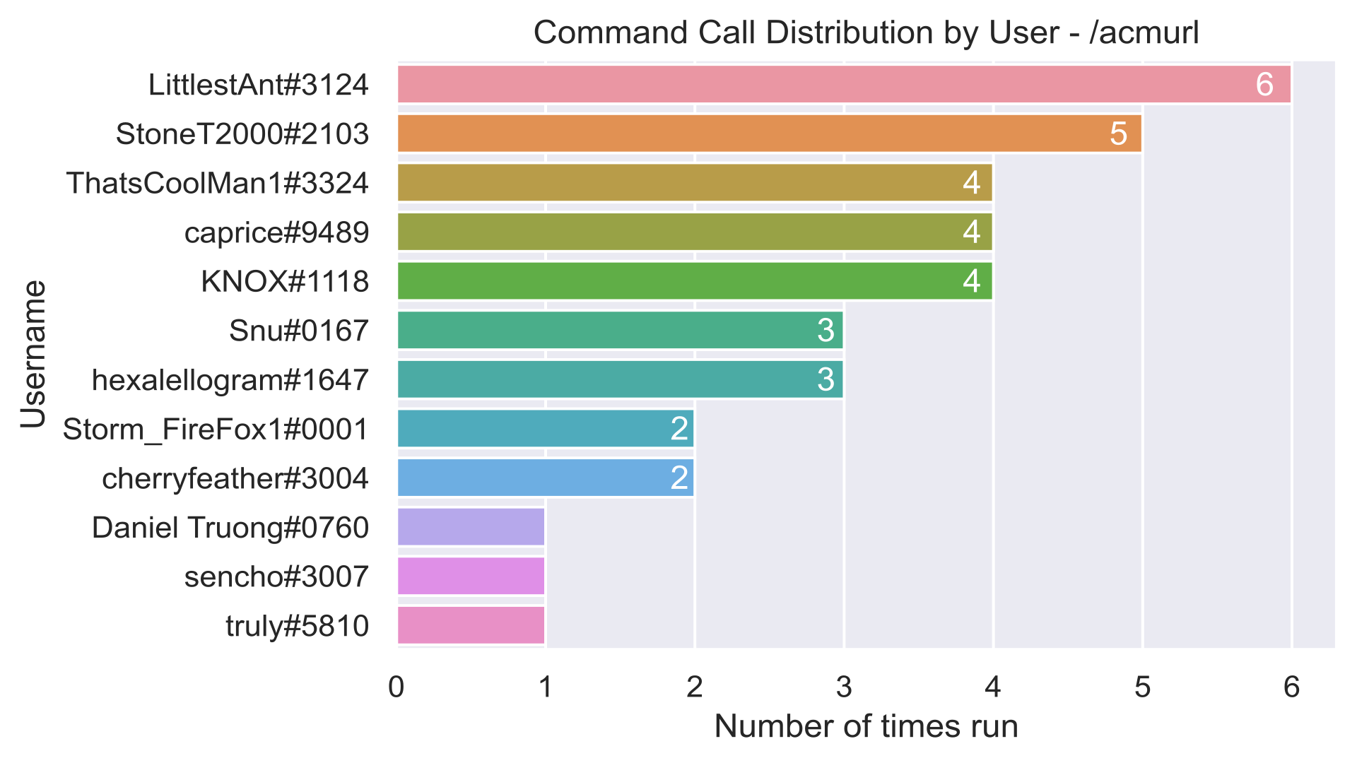
This makes sense, since in most cases, only board members use these commands, and generally the same users generate links for ACM’s url shortener.
Anyway, soon after fiddling with each command, I started realizing that the time stamp of each command would lead to an interesting metric of the times when members of the Discord server were most active.
Who stayed up late at night?
Visualizing time-based data, in this case, was a bit more complex, as it wasn’t just a simple bar chart. This time, a heatmap would do the job the best, so I split around the data, did some simple cross-tabulation and then rendered the heatmap (details in the Jupyter notebook). After that I had a nice heatmap of when commands were run over the course of a week.
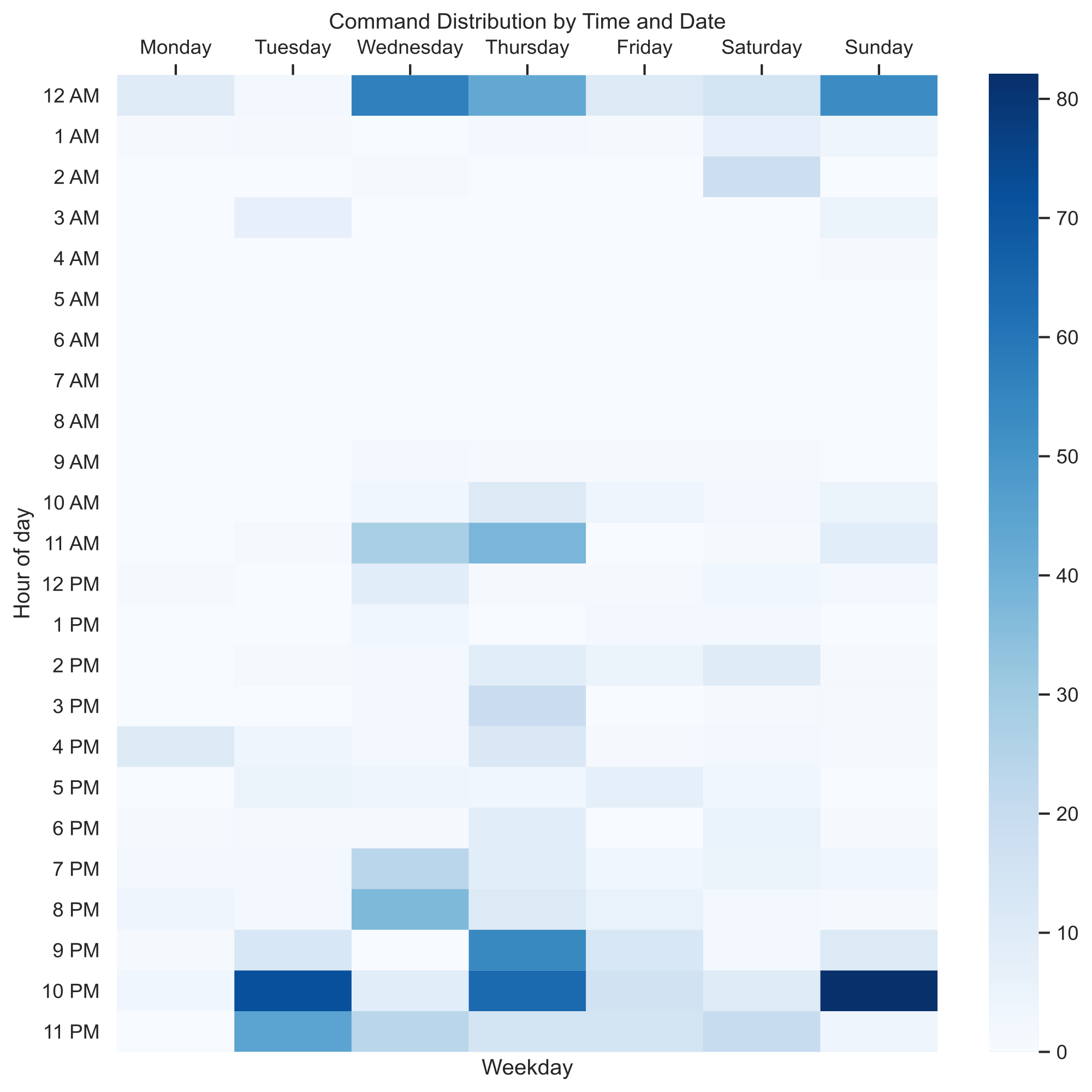
The thing that is immediately noticeable (which is also a piece of expected information) is that the commands are run more towards the end of the day. This is understandable, as members are more likely to socialize towards the end of the day; after all, we do have lectures.
I did realize soon enough, however, that this isn’t exactly data representative to the entire Discord server. This is because not everyone in the server used BreadBot’s commands, so evidently we don’t really have the full picture. Perhaps the most active members are the night owls, hence the bias towards later times in the heatmap I made. Therefore, I opted to get more data to be as accurate as possible, so I chose to just export all the messages of the Discord server.
Wait, is this what Google feels like? This is not good.
Stop me, I’m going too far
Funnily enough, a previous workshop hosted by ACM, (the data visualization workshop) which covered analysis of Discord data exposed me to a tool that can export entire Discord chats in CSV format. Cool!
(Yeah I know, very original of me to use the same data source for my post. I will concede that I started this before I saw the workshop in the works, so it’s more or less a miscalculation on my part.)
Anyway, to get the best view of the Discord’s server’s content, I decided to export all of the messages off all of the server’s channels. After eating milk and cereal waiting for all of them to get exported, I quickly ran the same data processing as I did before for the heatmap, but now improved. Here we go...
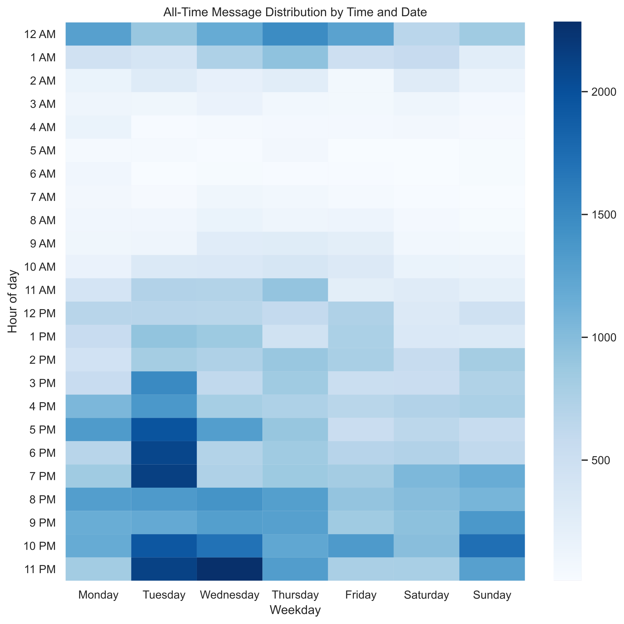
This heatmap was vastly more accurate, and also came with some pretty interesting revelations. First off, the server’s members had a wider variety of sleep schedules than I previously expected; no one sleeps only 3 hours a night, and the times the server didn’t have messages is very small. Additionally, the white areas (the times when the least amount of messages are sent) are mostly during times when people are sleeping, which further reinforces the fact that ACM’s Discord server is active almost 24 hours of the day!
If you're a member of ACM's Discord, you might already notice that members are incredibly active at around 2 AM, but this isn't really reflected in the heatmap. This is mostly because members are active in voice channels at around that time, and voice channel times are not easily exportable, nor present in my dataset.
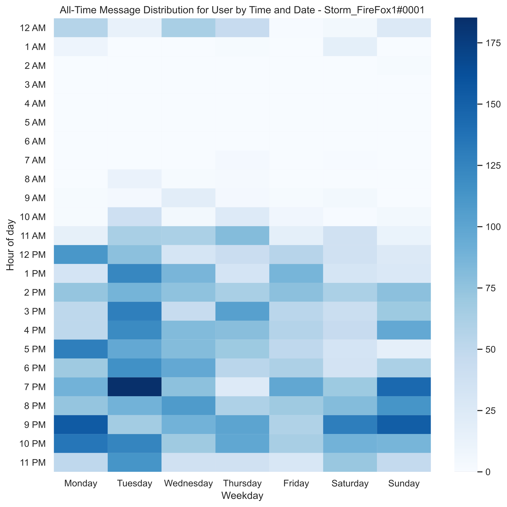
One could also do this to look at one person’s messaging habits by filtering all the chat messages to only include the specific user’s messages, and you can get a similar heatmap. Here’s mine:
But, most importantly, looking at the all-time heatmap above was the first time I was surprised by my graphics.
“What’s with the spike at 11 PM?”
You might’ve also noticed the spike of messages on Wednesdays at around 11 PM. Now, at first I was confused, but I quickly realized what that spike could be related to - most CSE course PA’s are due Wednesdays at 11:59 PM. I decided to test that and see from where most of the messages of the spike originated from.
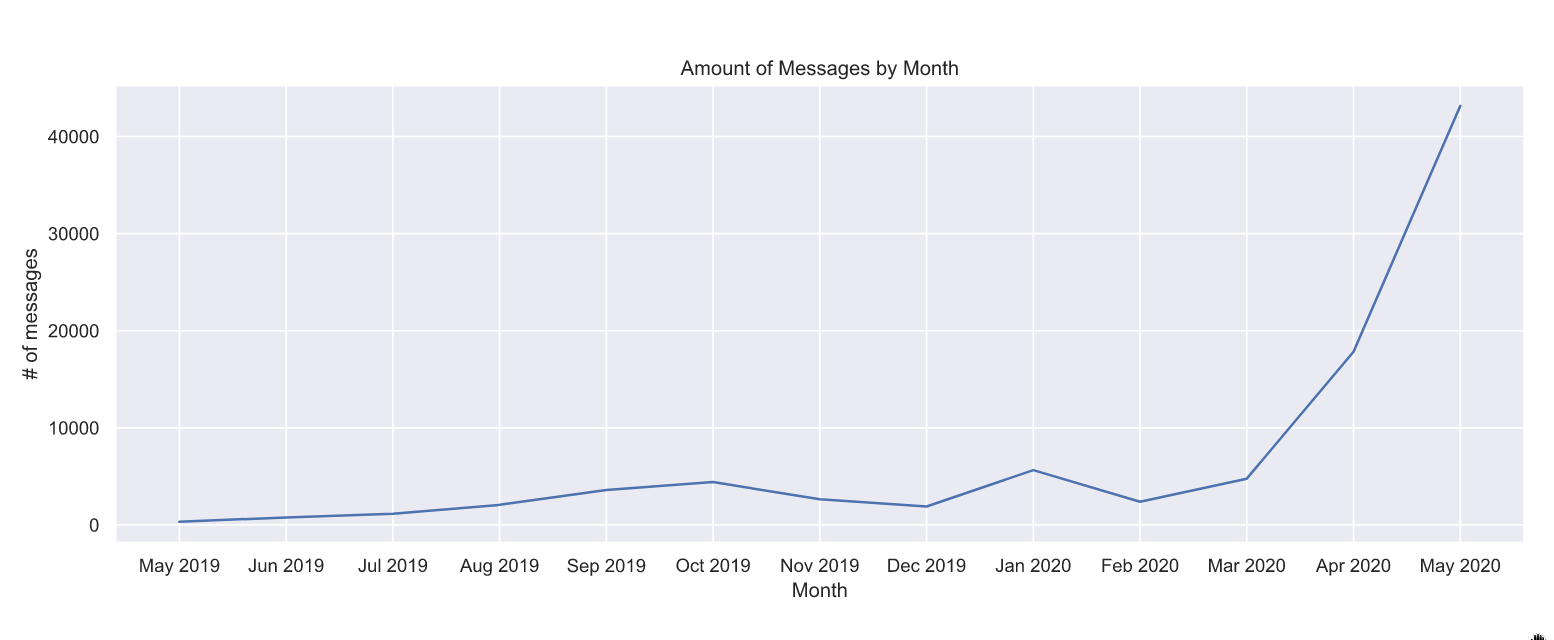
I started by looking at what Wednesdays had the biggest amount of messages sent at 11 PM and after. Surprisingly, one day stood out, which was the 27th of May. Looking at the data on that day directly, I noticed that a specific board conversation really dragged on, so turns out the spike is isolated. This was surprising, as I really thought it may have been a consistent behavior. In some way, this makes sense, as merely looking at the amount of messages sent per month, we can tell that there has been exponential growth in conversations ever since March of 2020.
But what about other more interesting conversations? More accurately, what are the most common topics to cause “spikes” in messages?
...wait. This is getting off the rails.
At this point, I think it’s good to take a break. I’m falling in a hole, tempted by the lure of big data, and I think the conversation starter question can be answered some other time. It’s also better if I gather some more data.
This was cool!
I forgot how fun data can get once you’re actually getting into it. Not only do
you get interesting tidbits of insights that would be lost to the smaller
picture occasionally, you can also find some more interesting information that
you could potentially apply in the future to your activities. For instance, in
this case, I noticed that, while /bread was the third most popular command,
it would’ve probably been more popular if its response time was shorter;
/bread takes the longest time to reply with a picture of bread compared to
similar commands like /dog , and sometimes it isn’t even bread! Therefore,
it’s likely people didn’t like it as much as the others. (Conjecture: no one
likes lootbox mechanics) Maybe I should fix it sometime...
Anyway, I encourage you to also try to have fun with data in other more interesting areas. Maybe there’s something you want to get more knowledgeable in, and perhaps looking at observations from the problem may help you come up with something kind of cool for the future. Whether it’s at your job, or maybe even in your personal life, I’m sure you’ll find something you’re missing. And if you don’t, well, at least you’ve gotten better at whipping up cool charts. Maybe that’ll get useful in a meeting sometime! :)
Make sure to check out the Jupyter notebook so you can be get familiar with the more technical aspects of data visualization. I don’t really get into the minutiae in this post, but you’ll find out how to make the same charts in there. All the code is commented and everything, so it’s good for future perusal.
Also, I uploaded the public dataset of Discord messages as of publishing day on the GitHub repo the Jupyter notebook is on. That way, maybe you can fiddle with it as well and whip up some even cooler-looking graphs.
Lastly, make sure to check out ACM’s Discord! It is active almost 24/7, and pretty much anything is talked about in it. You’ll have a good time for sure!